Spectral Phasor Example 2
This example shows the method for unmixing of three components by making a triangle
on phasor plot. The vertices of this triangle refers to phasor of pure components.
To start download the image from the link below :
This is an image recorded with a spectrograph with 128 spectral channels.This is
a cell stained with DAPI (DNA), Bodipy (tubulin) and Texas Red (actin). The description
about the sample can be found here.
From Image menu choose Stacks> Z Project... Then from Projection
Type choose Average Intensity.
Run Spectral phasor from Plugins menu. Enter 8000 in threshold box
and choose the show spectrum. press OK.
Comparing to Example 1,this time the central cloud is removed simply due
to higher threshold that we set.
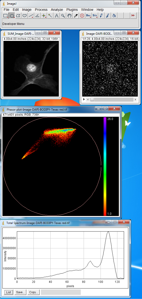
This image has three components but this is hardly visible from total spectrum and
only two peaks are clear in the plot. To extract the emission maximum of three components
we make three region of interests at the vertices of the phasor plot. Select Oval
from ImageJ Toolbar and make region of interests as shown in Figure below. Then
from Plugins menu choose Phasor To Image.
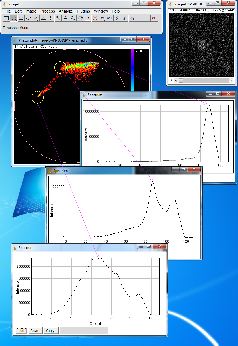
The region of interests and their spectra are shown correspondingly. Now three components
with emission maxima at channeles 66,86 and 108 is detected. These maxima correspond
to DAPI, BODIPY and Texas Red.
Now from Plugins menu select Phasor unmix. In the Max X1, Max X2 and
Max X3 you can enter the peak positions for the pure components that you expect
are present in the image. In the Combo Box there are four options: If you select
the Default ,the unmixing is performed based on the previous settings for
the reference points which is saved automatically on hard disk.
If you select Add manually three or Add manually two the trajectories
will be shown based on the numbers entered on the Max X1, Max X2 and Max X3 fields.
These trajectories are drawn by changing the width of a synthetic Gaussian spectrum.These
two options allows for unmixing of two or three components. The Show Fractions
option provides fractional images of each components. This provides fractional intensities
of components.
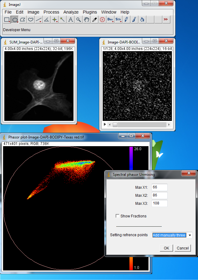
Now enter 66,86 and 108 for the Max X1, Max X2 and Max X3, select Add manually three
and press OK. These numbers correspond to the emission maximum of three components
extracted from previous analysis by making region of interests and choosing Phasor
To Image. The trajectories are drawn.
If you move mouse cursor on the phasor plot the corresponding spectrum of each phasor
point will be shown.
The reference points can now be estimated by extrapolating the phasor clouds to
the three reference curves.Select the reference point by clicking on the phasor
plot as shown in figure below.A very clear segmentation with minimal bleeding through
is achieved. The overlay RGB image and the fractional intensities are also shown.

Citation:
Farzad Fereidouni, Arjen N. Bader, and Hans C. Gerritsen,
“Spectral phasor analysis allows rapid and reliable unmixing of fluorescence microscopy
spectral images," Opt. Express 20, 12729-12741 (2012)
Sidebar Menu
Links
Search